INVITES
2020 — 2021

Develop an inclusive multiplatform system that creats a simple process of inviting friends to join YouTube TV and earn rewards using our existing UX components.
Role
Lead UX designer
Skills
UX Design
Prototyping
Lead UX designer
Skills
UX Design
Prototyping
User needs
>60% of YTV subscribers claim to be "promoters" of the service – highly likely to recommend to friends. Another 20% are very likely (7-8 out of 10). However, we have no incentive today for them to do so.
>60% of YTV subscribers claim to be "promoters" of the service – highly likely to recommend to friends. Another 20% are very likely (7-8 out of 10). However, we have no incentive today for them to do so.
Challenges
*Creating a design system that is scalable for all three platforms (mobile, web, TV)
*Creating complex designs that combine instructions, education and new actions like sharing a code while trying to use existing components
*Fitting a complex flow into a simple page
*Include the necessary and legal information in the right spots
Design principles
*Scalable — Web designs that scales well to mobile. Create designs that will work with other rewards / future features
*Clear — Have instructions & limitations that are clear and easy to understand while including all the legal copy required
*Intuitive —Make it easy to send, receive invites and see reward progress


Impact [cumulative summary]
*19,744 trial starts
*87.36% trial retention rate
*19,744 trial starts
*87.36% trial retention rate
Team
PM – Stephanie Leung
Eng – Yeonjae Park (mobile)
Patrick Chapman (web)
UXW – Andrea Alabastro
Other partners — Legal, Commerce
PM – Stephanie Leung
Eng – Yeonjae Park (mobile)
Patrick Chapman (web)
UXW – Andrea Alabastro
Other partners — Legal, Commerce
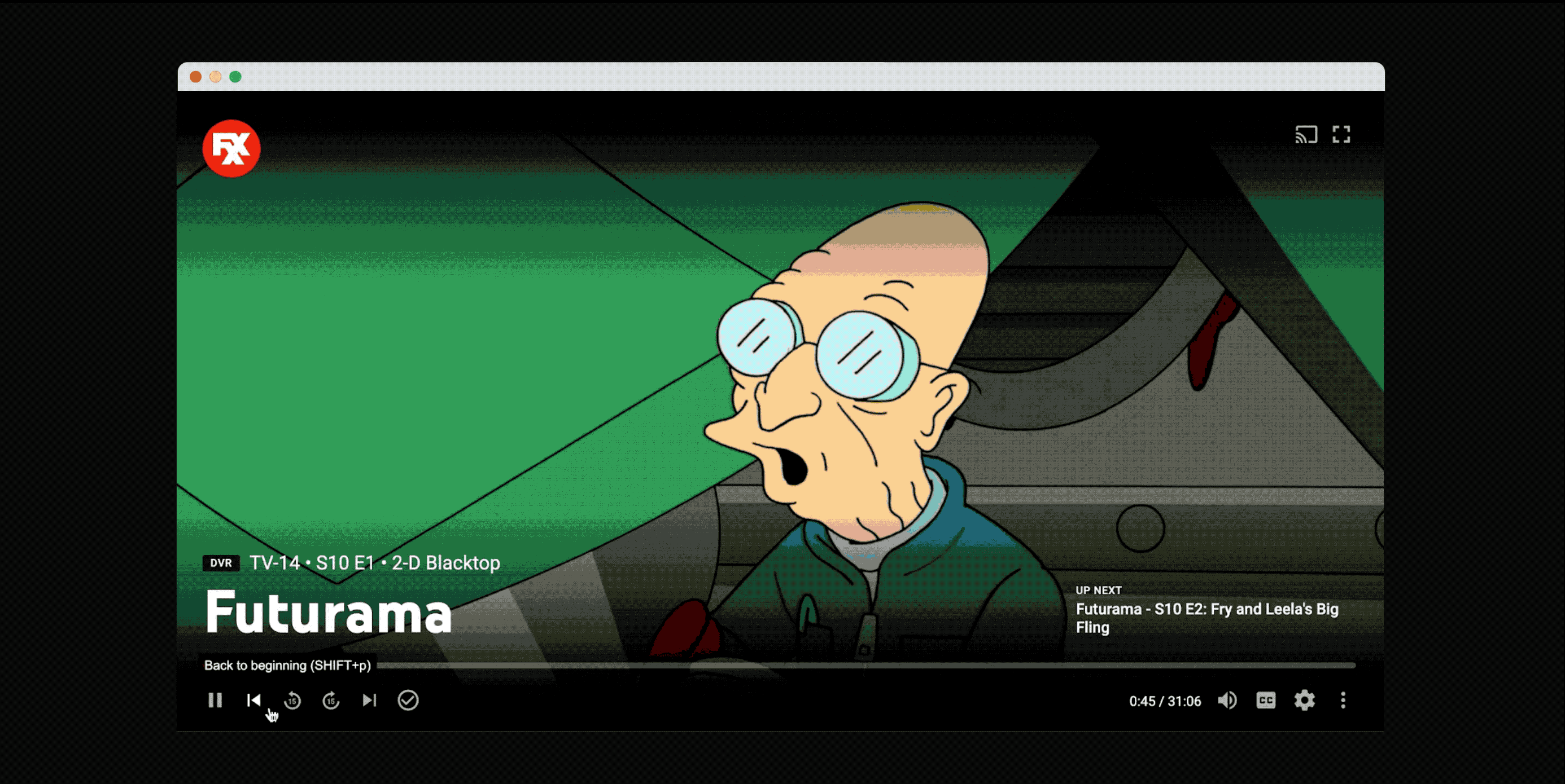
LIVE GUIDE — v1
2021 — 2022![]()

Complete overhaul of YouTube TV's Live Guide (EPG) on the TV platform.
Revamp the design of the Live Guide to achieve a visually polished and captivating appearance, all while addressing the primary user requirements and incorporating seamless navigation through an extensive selection of 100+ networks.
Role
Lead UX designer
Skills
UX Design
Prototyping
Lead UX designer
Skills
UX Design
Prototyping

User needs (from UXR)
*The ability to scroll horizontally to see future programs
*Additional show information available with an extra click or on selection
*Seeing a lot of information with a quick glance at the screen
*An efficient use of space, with rows and columns visible without navigating
*The ability to scroll horizontally to see future programs
*Additional show information available with an extra click or on selection
*Seeing a lot of information with a quick glance at the screen
*An efficient use of space, with rows and columns visible without navigating
Challenges
*It is a heavily used page [represents ~45% of watch time] therefore this redesign is very high impact
*It hasn’t been redesigned in a really long time, there is plenty of feedback from Engineers, PMs & the Design team
* There are many edge cases, content types, past and upcoming projects the new guide has to account for
Design principles
*Preserve the EPG while unlocking more discovery
*Design for efficiency and simplicity
*Create a guide that flexes for upsell and non-live
*Preserve the EPG while unlocking more discovery
*Design for efficiency and simplicity
*Create a guide that flexes for upsell and non-live

Preserve the EPG while unlocking more discovery
↳ Improved navigation through 100+ channels
↳ Improved re-ordering
↳ Introducing p13n, ensuring EPG is predictable
↳ Improved navigation through 100+ channels
↳ Improved re-ordering
↳ Introducing p13n, ensuring EPG is predictable
Design for efficiency
and simplicity
↳Focused highlighted state for more metadata
↳Secondary actions (e.g. Add to Library)
↳Less repetition of text
and simplicity
↳Focused highlighted state for more metadata
↳Secondary actions (e.g. Add to Library)
↳Less repetition of text
Create a guide that flexes for upsell and non-live
↳Improved support for non-24/7 channels
↳Live upsell for new networks
↳Improved support for non-24/7 channels
↳Live upsell for new networks
Impact [cumulative summary]
*1.9% reduction in paid churn after launching 90%
*Users are 3% more satisfied with the new experience (HaTS survey)
*Presented designs & findings at Google TV workshop
*1.9% reduction in paid churn after launching 90%
*Users are 3% more satisfied with the new experience (HaTS survey)
*Presented designs & findings at Google TV workshop
Team
PM – Kathryn Cochrane
Eng – Hanfei Sun
Maya Jergusova
UXR – Sophie Amberkar
PM – Kathryn Cochrane
Eng – Hanfei Sun
Maya Jergusova
UXR – Sophie Amberkar
*FULL PROJECT COMING SOON* *FULL PROJECT COMING SOON* *FULL PROJECT COMING SOON*
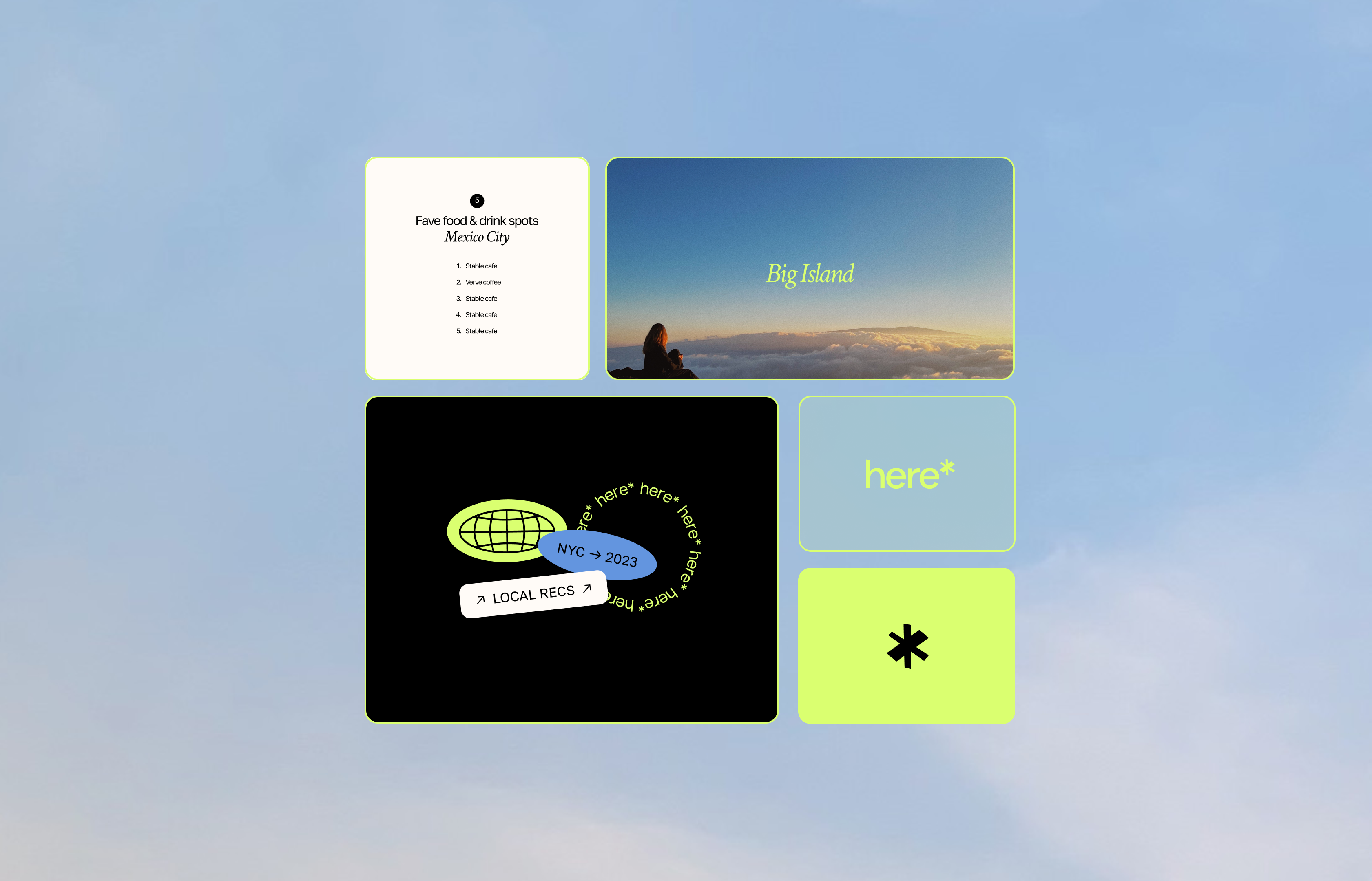
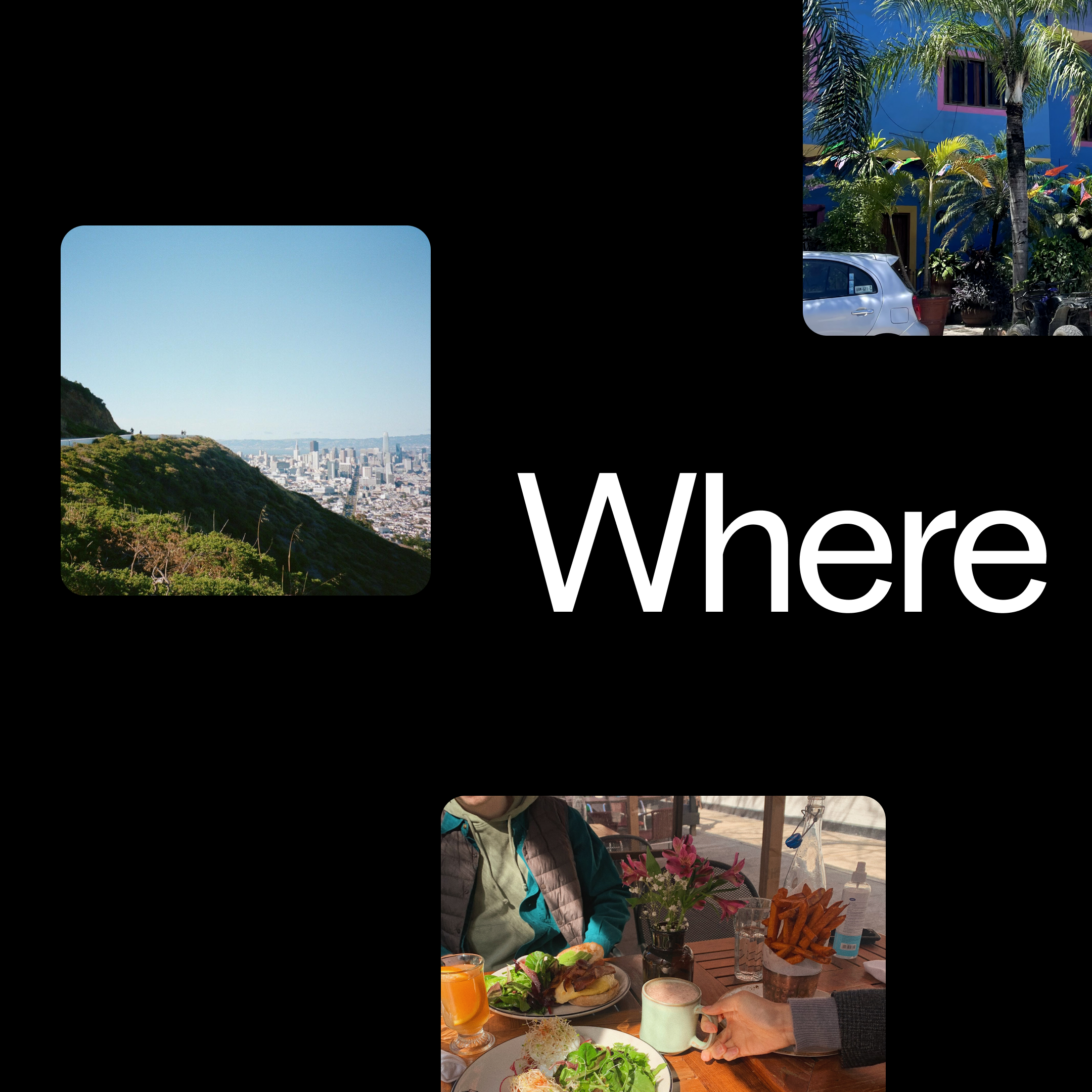
here*
here*
2023 — present
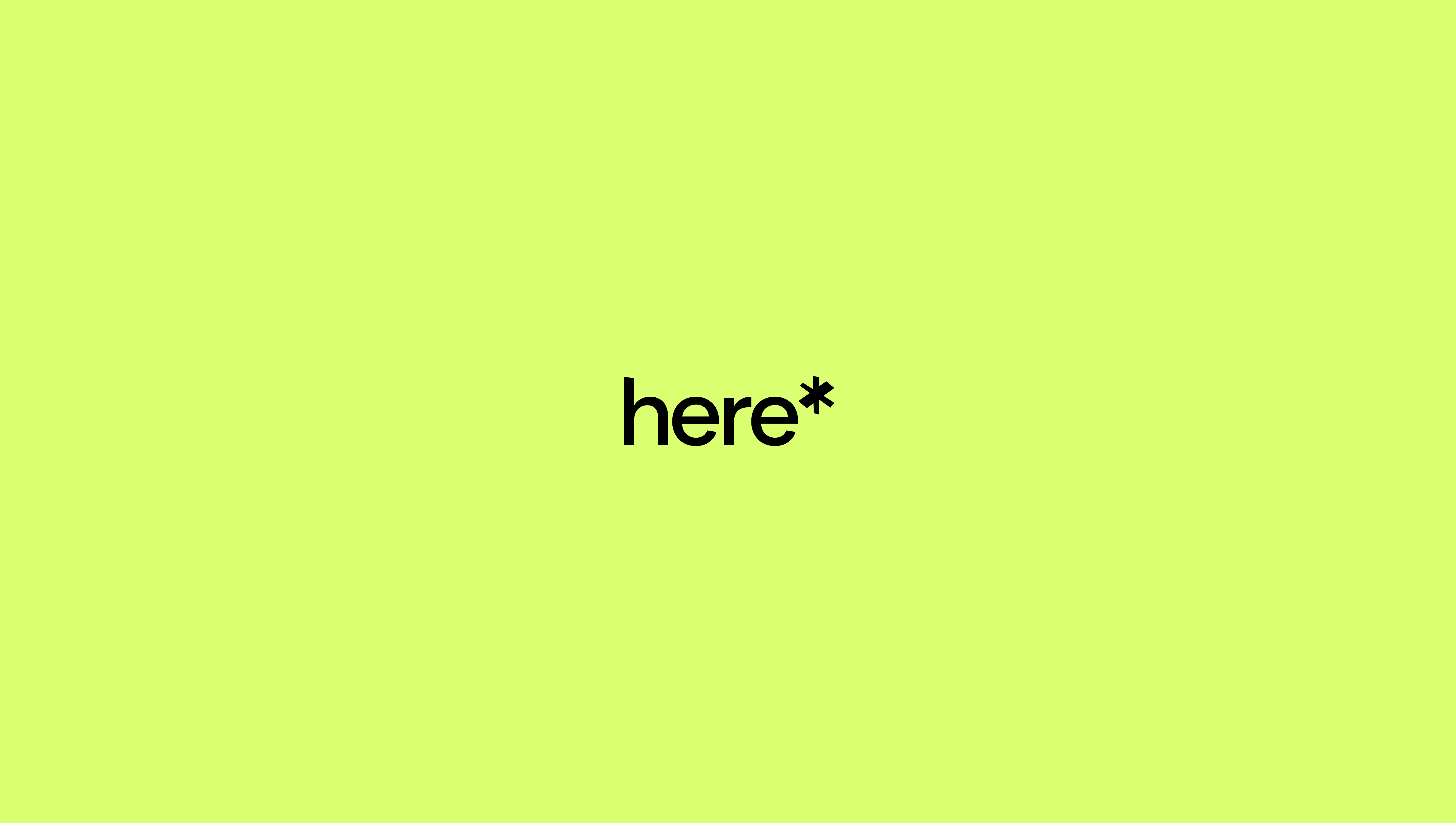
Re-branded a new product that is launching soon. In collaboration with the founder, I lead the redesign of here*. I gave brand direction, created a new logo, color palette, new set of icons and made an extensive brand guidelines. Currently I’m focusing on social media posts/marketing. More details coming soon...
* We create a modern platform for people to discover and share favorite spots of a city. Our mission is to inspire everyone to reflect and share their experiences with people they love.
Role
Lead Visual designer
Skills
Visual design
Design systems
Social media marketing
Lead Visual designer
Skills
Visual design
Design systems
Social media marketing


PLAYER
2019
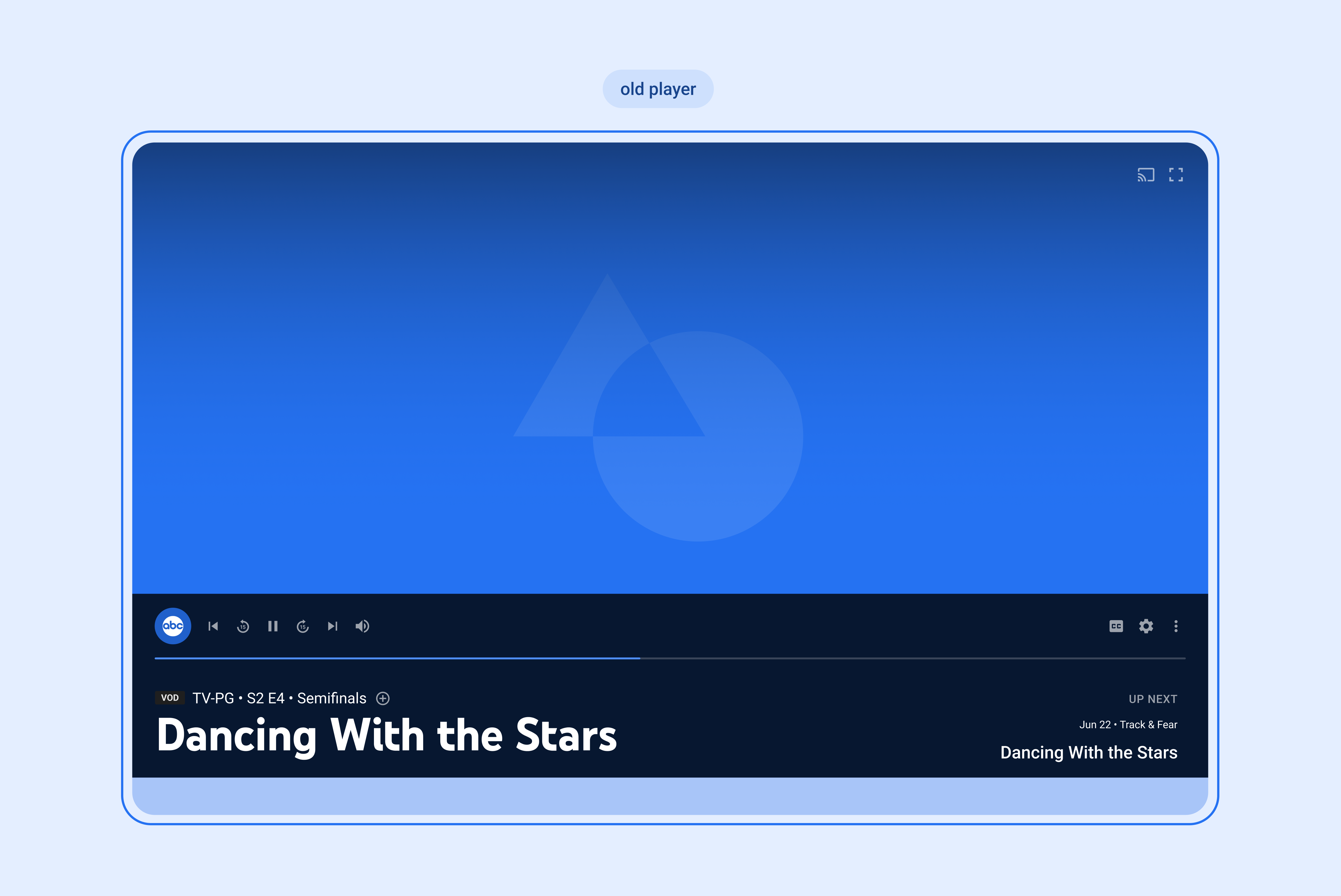
Enhance the web player user interface to tackle prevalent user concerns while ensuring a consistent visual experience across platforms. Additionally, establish a solid foundation for upcoming projects aimed at expanding the web player's functionality.
Role
Lead UX designer
Skills
UX Design
Prototyping (HTML+CSS)
Lead UX designer
Skills
UX Design
Prototyping (HTML+CSS)

User needs
*Many Player controls remain undiscovered
*Users unsure which elements are clickable
*Overlay UI covers too much of the video
*UI breaks when page is scaled downv
*Many Player controls remain undiscovered
*Users unsure which elements are clickable
*Overlay UI covers too much of the video
*UI breaks when page is scaled downv
Design updates
*Rearranged UI with softer edges to cover less of the video and look more modern
*Added tooltips to button icons to inform users about shortcuts and make buttons look more clickable
*Added breakpoints and miniplayer version in small sizes to make designs scalable
*Brought the UI closer to our TV in order to enable web to include features from TV in the future
*Added more a11y features with tab targets and keyboard controls

Impact [cumulative summary]
*19,744 trial starts
*87.36% trial retention rate
*19,744 trial starts
*87.36% trial retention rate
Team
PM – Stephanie Leung
Eng – Yeonjae Park (mobile)
Patrick Chapman (web)
UXW – Andrea Alabastro
Other partners — Legal, Commerce
PM – Stephanie Leung
Eng – Yeonjae Park (mobile)
Patrick Chapman (web)
UXW – Andrea Alabastro
Other partners — Legal, Commerce
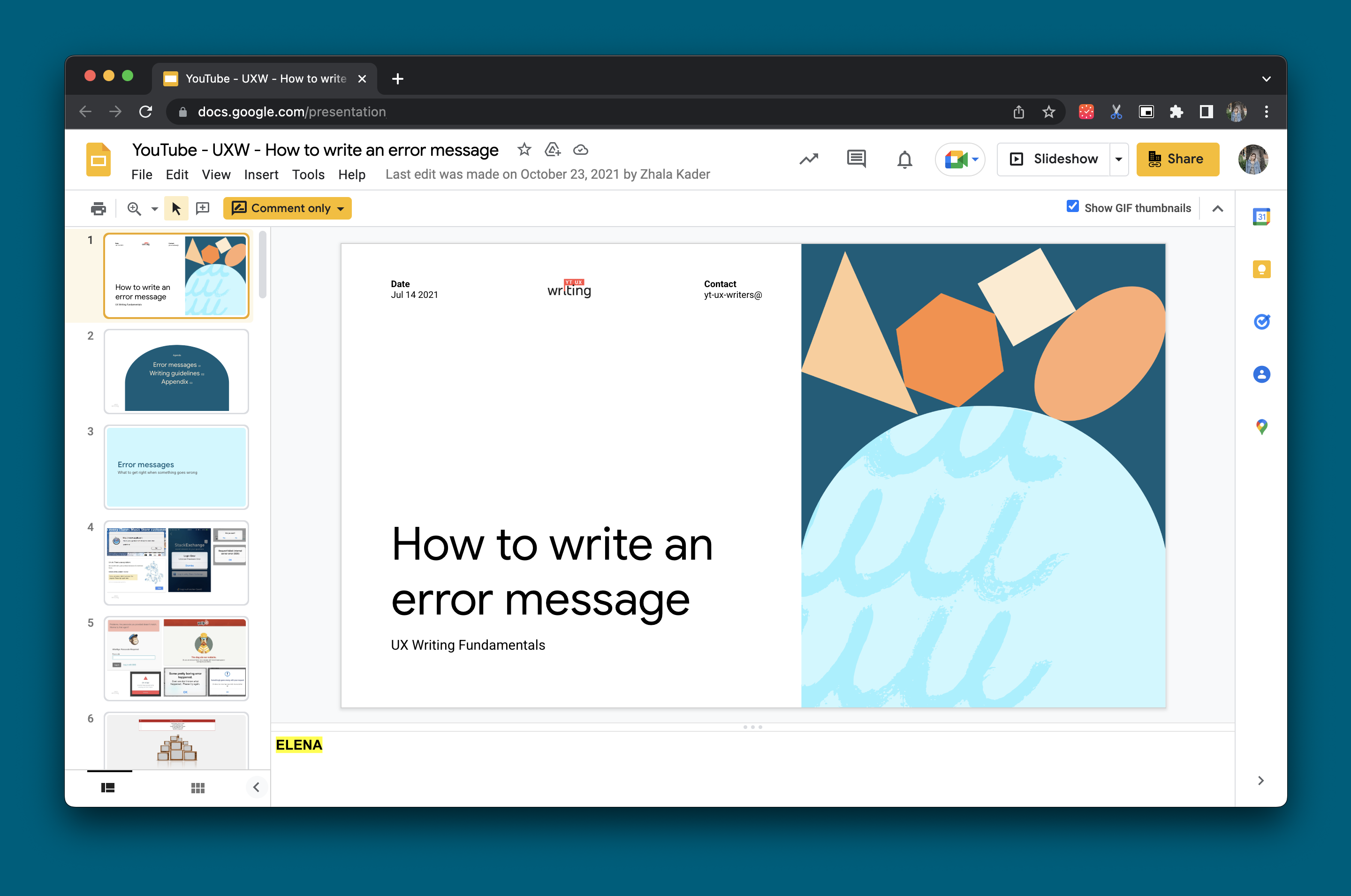
UX Writing Team Identity
2020![]()
Created a brand for the UX writing team at Youtube. The brand elements were used in presentations and figma files.
Role
Lead Visual designer
Skills
Logo design
Visual design
Lead Visual designer
Skills
Logo design
Visual design
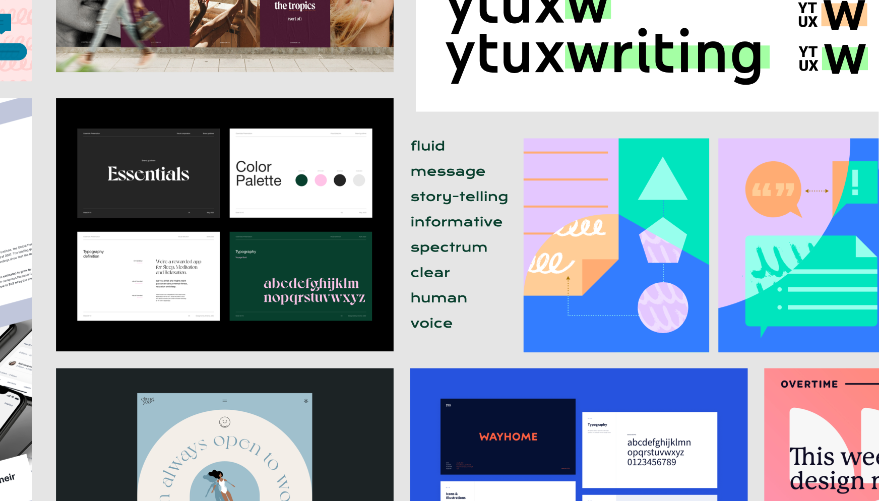
Design process
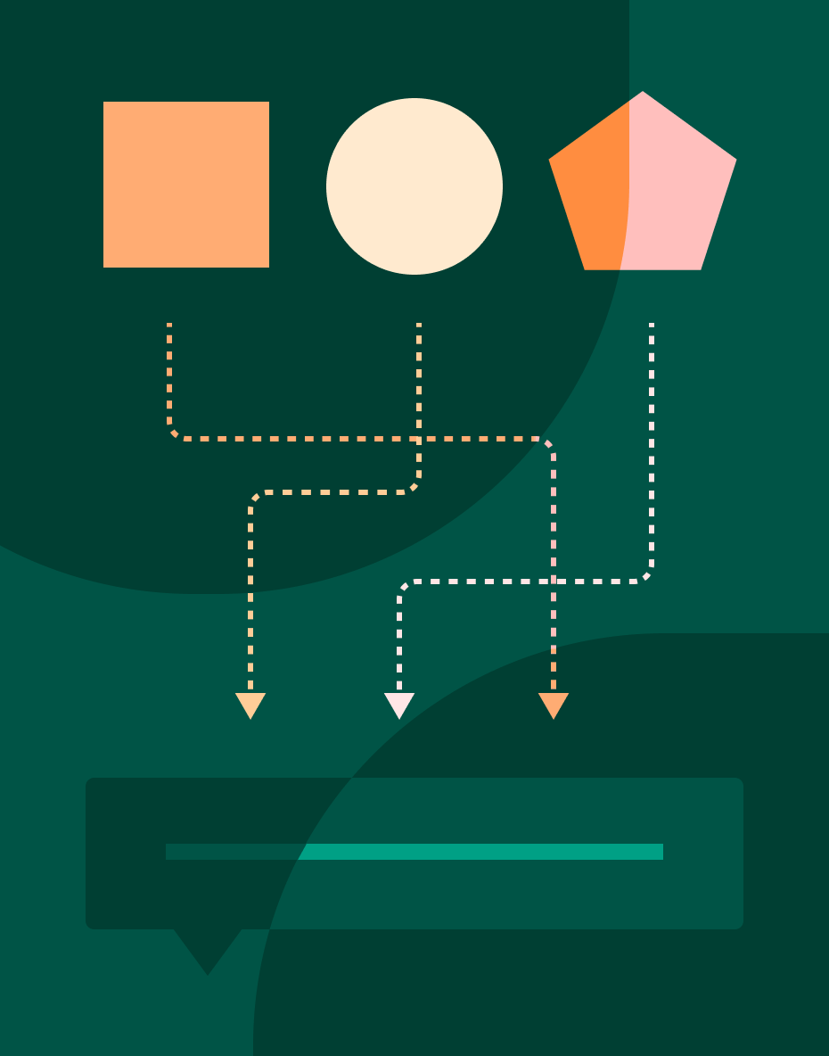
*I used YouTube writing principles document to get inspiration & collected key words like fluid, story-telling, human, clear, informative.
*Colors were selected from the broader YouTube color palette that felt human and clear.
*I used already existing elements & shapes YouTube uses to create compositions that resembles “story-telling” to be used on decks
*The logo uses the YouTube colors & typography with a little hint of what UX writing does
Deliverables
Color palette, logo, illustrations, figma sticker sheet and a deck template.
Color palette, logo, illustrations, figma sticker sheet and a deck template.


Impact
Sticker sheet was used in multiple figma files and deck template is being used for presentations made by the UX writers
Sticker sheet was used in multiple figma files and deck template is being used for presentations made by the UX writers
Team
UXW partner – Andrea Alabastro
UXW partner – Andrea Alabastro